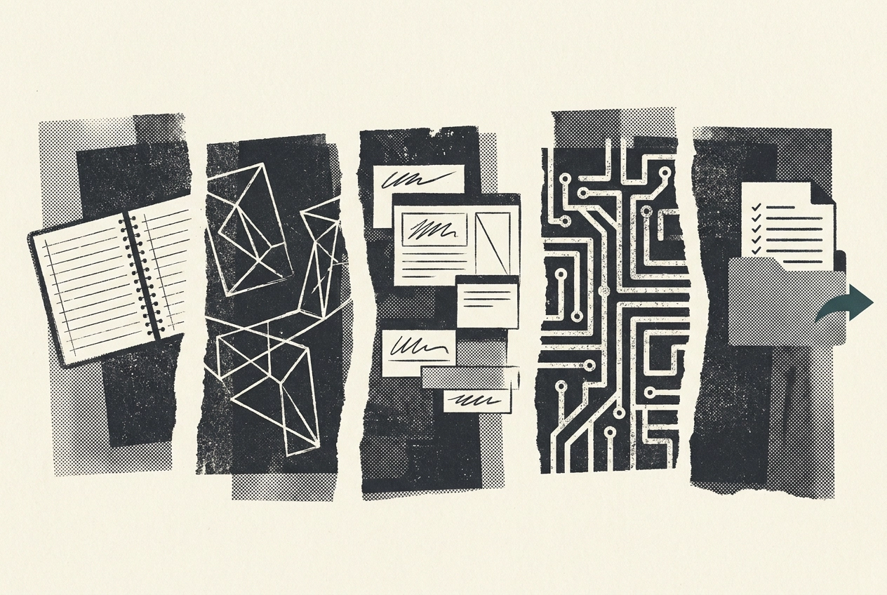
Ever looked at a beautiful website design portfolio and thought, lovely, but what was it actually like to work on that project? You are not alone. Most portfolios show the polished final pixels. They skip the messy, useful bits: the questions asked, the arguments had, the decisions made, and the moments where the project could have gone either way. That is a shame, because what projects actually run on is the schedule, not the visuals. This post pulls back the curtain. We will follow a website design project stage by stage, covering Discovery before anyone picks a pixel, Structure where the sitemap gets argued about, the UX design process from journeys to wireframes, UI design and how the thing actually looks, and developer handover where done gets defined. You will also see how to read a website design services proposal against those stages, plus five things to take away before you sign. By the end, you should know what to expect, what you will be asked to decide, and where the handover gates sit. Let's get into it.
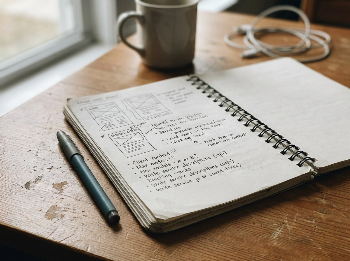
A portfolio page shows the finished thing. A hero image. A case study screenshot. Maybe a slick scroll animation. It never shows the two week stretch where you were asked to write your own service descriptions, or the afternoon you spent choosing between two navigation models. Those unglamorous moments are where your project actually lives.
That gap matters because what projects actually run on is the schedule, not the visuals. A proposal that spells out stages, decision points and sign-off gates is really selling you a schedule of your own commitments. That schedule is what most projects run on. Software projects have long failed on scope and schedule, not visuals (CHAOS report), and websites are no different.
Every stage in this walkthrough has three parts: what the studio does, what you supply or decide, and the gate that must open before the next stage. For a preview of those commitments, see What You Can Expect.
Studios label stages differently, and that is fine. What matters is whether the sequence, decisions and gates are written down before you sign. That is what lets you compare two website design services proposals on the same terms, not on whose mockup you liked best in the pitch. Our Latest from the blog has more process walkthroughs.
Discovery is the only stage where the goal is to understand the problem, not solve it. Nobody picks a pixel yet. The studio needs to know who your users are, what they need to do and what the site must achieve commercially. Then come the constraints: technology, legislation, budget and internal approvals.
Expect to be interviewed, not just briefed. A proper discovery asks about your sales process, the questions customers ask before they buy, what your support inbox looks like and what your competitors are doing well.
Pull together analytics and existing content. Name the three to five people who genuinely make decisions. Block out time for a workshop. Discovery can run as a standalone paid phase or inside a design sprint, so you can pause on the findings before committing to build.
Scope gets set here: what the project will and will not cover, a map of the end to end user journey, a deliberately narrow minimum viable product, and a written list of risks and constraints. Graphics Monkey has run this on a fine art website design project and across digital and web design briefs alike; the questions do not change.
The gate is an evidenced decision to stop or proceed. If discovery shows the real problem is your content, your internal process or a piece of compliance you have not sorted, the honest outcome is to fix that first. Only once those findings are agreed does the sitemap conversation start.
Discovery told you what the site needs to do. Structure decides where everything lives.
This is the unglamorous middle of a website design project: sitemap, page hierarchy, navigation model, URL logic and a content inventory. It is also where creative website design ambitions meet the blunt reality of how many pages you actually have content for. That shiny ten page structure looks great until someone counts the four paragraphs you own.
Expect at least one argument about navigation labels. The sitemap is the earliest visible picture of what your business thinks it is, so internal politics surface here first. Departments will quietly lobby for a slot.
Review the sitemap and confirm which pages make version one, and which are genuinely later.
Decide how old URLs are handled. Redirects do not trigger de-indexing, so plan the map properly rather than 404-ing your way to a fresh start.
Name a content owner on your side. One person, not a committee.
A sitemap organised around your org chart instead of user tasks. If the navigation mirrors departmental names, visitors have to guess which department owns their problem. URLs should follow user need rather than internal names that might change.
The gate: a signed off sitemap and content plan, with a named owner for copy and assets. Skip it and you will spend the design phase discovering that half your pages have nothing to fill them.
With the sitemap signed off, the work shifts from what pages exist to how they behave. Stage 3 is the ux design process proper: task flows, wireframes, edge cases and states. Empty, loading, error and success states all get designed now, not discovered in build. Accessibility sits here too. WCAG AA is a sensible baseline for commercial website design in 2026, not a nice to have.
Wireframes look deliberately plain, and that is the point. The decision in front of you is not whether you like them but whether the flow makes sense to someone who has never heard of your business. If you need to explain a wireframe, it is wrong.
What you will be asked to do: click through a prototype end to end and leave feedback in one place, in one round. Consolidating feedback is the single biggest favour you can do for your timeline. Scattered comments across email, calls and margin notes lose weeks.
If you have real users to test with, use them here. Even a handful of short sessions with real users tends to surface more than weeks of internal debate, watch someone try to book, enquire or buy and you will learn more than any stakeholder meeting.
The gate: a signed-off prototype, with usability issues either resolved or logged against a named owner. For digital product design work such as portals, dashboards or booking systems, expect this stage to run longer and heavier than the UI that follows. Next comes the bit everyone has been waiting for: how it actually looks.
Once the prototype is signed off, the plain wires get dressed. UI design is where your brand, typography, colour, imagery and motion come together, and where the design system gets decided. That choice shapes every page you add after launch, so it is worth getting right now rather than patching later.
What you will be asked to do: review two or three visual directions, pick one, then review page designs in batches rather than one page at a time. Batched reviews keep momentum and stop the project turning into a slow negotiation. Before feedback starts, agree the rules: one decision maker, comments gathered into a single document, and a clear answer to whether a comment is a preference or a genuine problem. That one distinction saves weeks.
Ask to see responsive behaviour at mobile widths and the key interactive states, not just desktop comps. Static screenshots hide the parts of a website design that most often go wrong in build. WCAG AA includes the reflow criterion (SC 1.4.10): content should reflow at 320 CSS pixels without two-dimensional scrolling, so mobile review is a requirement, not a nicety. Read the W3C guidance on reflow
The gate is final page designs plus a handover pack: components, tokens, states, spacing rules and asset exports. That pack is the difference between a design that gets built accurately and one that gets rebuilt by the developer. You can see how this plays out in our recent projects and in a recent website design project.
That handover pack only earns its keep if it governs the build. Developer handover is a gate, not a ceremony: before work starts, what done means gets written down and agreed by both sides.
Annotated designs, design tokens, every component state (default, hover, focus, error, empty), responsive specifications, exported assets, final copy in its final form, and acceptance criteria for each template. Copy arrives finished, because placeholder text in build has a habit of surviving to launch.
Sign off the design freeze. Name the person running quality assurance on your side. Agree how changes are handled after freeze, so a late request gets priced and scheduled rather than absorbed silently. Silent absorption costs you elsewhere, usually in budget or polish.
Expect design QA rather than silence. Someone from the studio should review the staging site against the designs, check accessibility, and test across browsers and devices before launch. Accessibility is testable, not a matter of taste, and automated tools alone will not catch everything.
Redirects, analytics, sitemap, page titles and meta descriptions all get checked, followed by a short handover session so your team can edit content without breaking the layout.
With the build signed off, you're ready to read the next website design services proposal with a sharper eye.
With handover gate shut and build underway, the website design services proposal you signed is now the script. Read it back against the five stages and see what it leaves out.
Map each stage: discovery, structure, UX, UI, handover. If a proposal skips discovery, that work still happens, just informally and at your expense.
Check your responsibilities are named with time attached. Who writes copy, when, and how long do you get for feedback? A common cause of a late website design project is content and feedback arriving after design has moved on. "Client to supply content" without a date is a warning sign.
Ask what each gate is, who signs it, and what happens when a change lands afterwards. Written change control is not bureaucracy. It's the thing that keeps a fixed budget fixed. A quick read of how much do other design projects cost? shows how fast scope creep moves the number.
Ask how creative website design options are presented and how many revision rounds sit inside each stage. Unlimited revisions sound generous, but they usually mean scope was never pinned down.
Finally, if your project leans towards digital product design, expect discovery and UX to be bigger line items and UI smaller. A split identical to a five-page brochure site deserves a question.
So read it closely, and treat every unanswered question as a reason to pause.
So you have the five stages in hand. Here is what to do with them before you sign anything.
Compare processes, not portfolios. Two quotes that look similar on price can differ significantly in scope if one has left discovery out. You are buying a way of working, not a mood board. (Also useful: what are the pros and cons of hiring a design agency?.)
Budget your own time honestly. Workshop days, copywriting, image sourcing and feedback rounds are not interruptions to the project. They are the project. If you cannot give those hours, say so at proposal stage, not week six.
Name one decision maker. As noted earlier, name one decision maker and give them authority to sign every gate.
Get "done" in writing. For each gate, agree exactly what finished means: signed sitemap, approved prototype, frozen designs. If an agency cannot answer that before kick off, the certainty you are buying is thinner than it looks.
Then talk to us. Graphics Monkey runs website design and digital product design projects in these five stages, and we will happily walk you through what each one would ask of you before you commit to anything. No pitch theatre, just the plan.
That is how you turn a website design project from a leap of faith into a clear, calm build. Now you know the stages, you are in a position to ask the right questions. If you want a team that walks you through each stage before you commit, come chat with Graphics Monkey. No pitch theatre. Just a plan you can trust. Let's make something good, properly.