A racecourse is a wonderful thing. It's also a conference centre, a party venue and a boardroom with a better view than most boardrooms. Two completely different audiences, one brand.
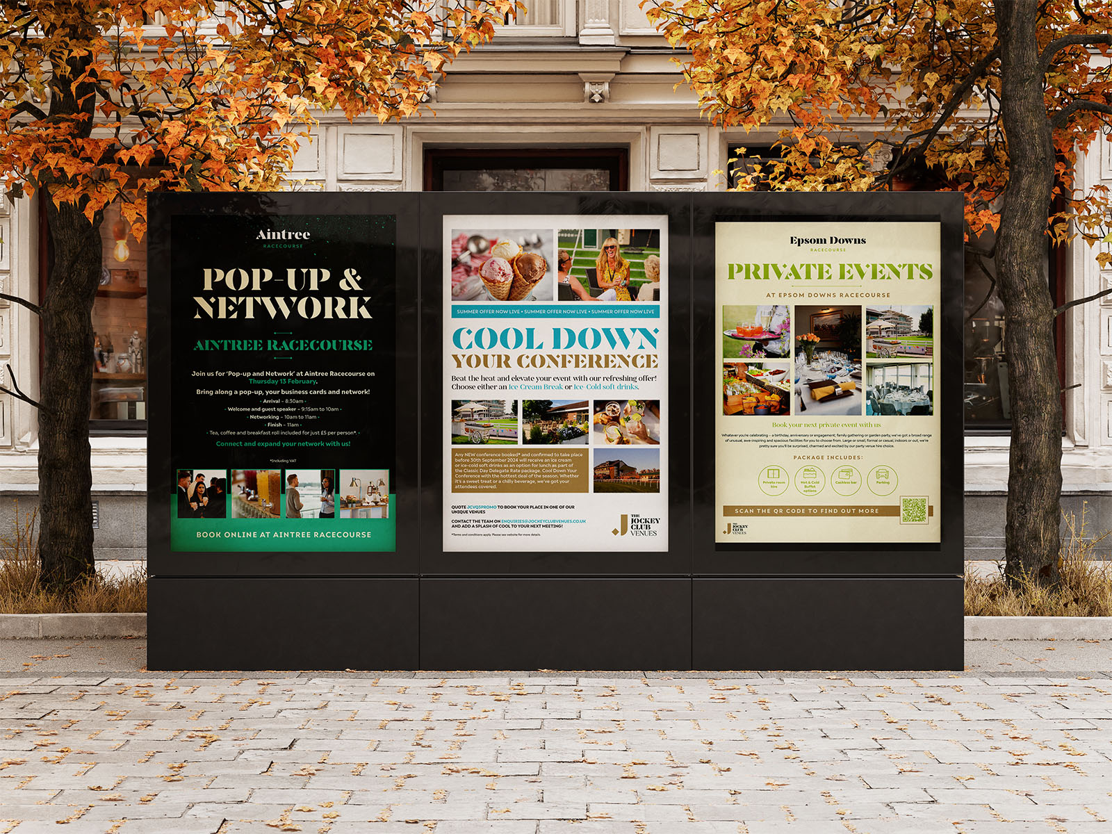
That's the job we've been doing for Jockey Club Venues: an evolving suite of collateral for B2B audiences — the people who book conferences, corporate events and hospitality, rather than the people who come for the racing.
Racing fans don't need persuading. Corporate bookers absolutely do. When they're weighing up your venue, they're comparing you to a hotel, a country house and a city-centre conference space, and judging on capacity, transport, catering, AV — and, quite reasonably, whether the place feels special.
So this collateral has a different job. It has to sell the space as a space: the rooms empty and full, the light, the scale, the food, and the one thing a racecourse offers that a hotel ballroom can't — a day nobody forgets. That's sales material first: printed brochures and digital presentations that work in a pitch and again as a leave-behind.
The work isn't a single brochure. It's a suite that has grown with the venues — printed brochures, digital presentations, venue maps, signage and sales materials — across Cheltenham, Sandown Park and Epsom Downs, and expanding to more.
That's a harder design problem than a campaign, in a good way. Each venue has its own character: Cheltenham isn't Epsom, and neither is Sandown Park. But a buyer comparing all three shouldn't feel they're looking at three different companies. Getting both of those things true at once is the whole trick.
Elegant typography. It carries the aspiration quietly. In venue marketing, luxury reads as restraint rather than decoration.
A refined palette. Consistent across the suite, so each venue feels like a different room in the same house.
Atmospheric photography. The spaces and the setting do more selling than any headline we could write.
A modular layout. New venues, new formats and next season's dates slot in without a redesign.
Most sports print talks to fans. This talks to procurement. Same studio discipline — grids, hierarchy, print-ready artwork, sign-off — pointed at a very different reader. It's a good reminder that "sports print" runs from a 16-page hospitality programme to a venue map someone follows to the car park, and that the second one is often the harder sell.
Take a look at the Jockey Club Venues project or see more of our sports and event print work. We're a design studio in West London, and we're happy to talk through a season's worth of collateral long before the first deadline.