Nobody picks up a governing body's annual report for fun. They pick it up because they have to — and that's exactly what makes it a design job worth caring about.
We've been designing the RFU report and accounts since 2020, and it is one of the least glamorous, most satisfying pieces of design work in the studio. Financial tables, governance detail, amends, sign-off, a hard date. No hiding behind a moodboard.
Most design briefs start with "how do we make this look good?". A report and accounts starts with something harder: how do we make a dense, regulated, heavily reviewed financial document genuinely readable, without touching a single number?
The 2020 edition was a full design, layout and production job. Following the updated brand guidelines, we designed the creative and the layout for a substantial report and accounts document. The defining requirement wasn't flair — it was care. The work had to be meticulous enough to track accurate financial content through every round of amends, and to keep doing it as the numbers moved. Page by page, table by table. Nothing shifts on its way to the reader.
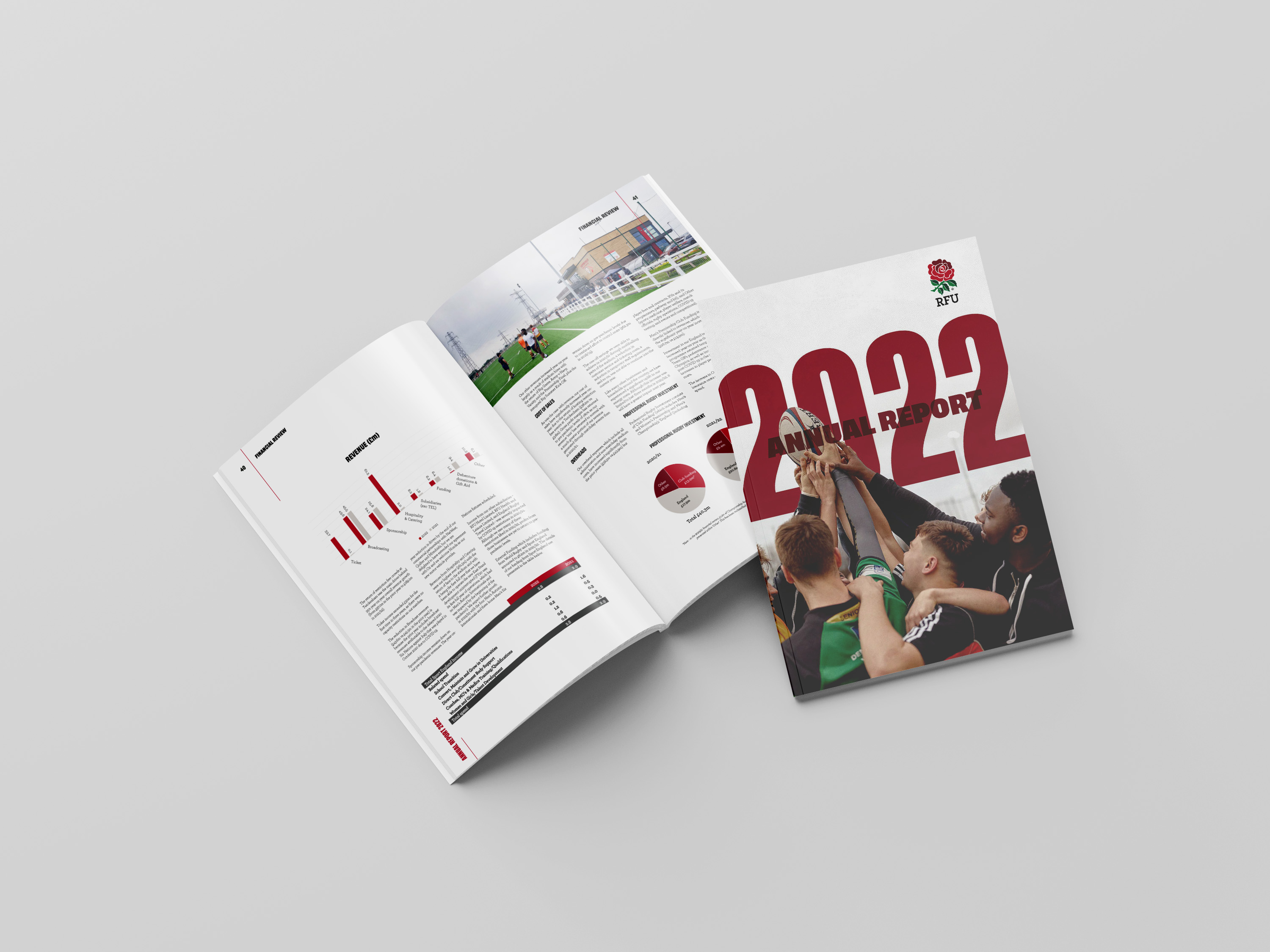
When you're on your third edition, you get to improve rather than start again. Building on the previous two years' reports, the 2022 report evolved the identity, kept a familiar framework, and came back with a cleaner look and feel.
The most visible change was more use of infographics alongside the traditional financial tables. That's the bit that does the heavy lifting for a reader who will never read a spreadsheet. A table answers "what were the numbers?". An infographic answers "what happened, and does it matter?" — and a governing body has both audiences to serve in the same document.
The RFU report has come back to us year after year — the 2022 edition was the third year in a row we'd designed it, and the 2023 report was awarded to us too. That's the real result, and it isn't down to a clever cover.
It's down to the boring things:
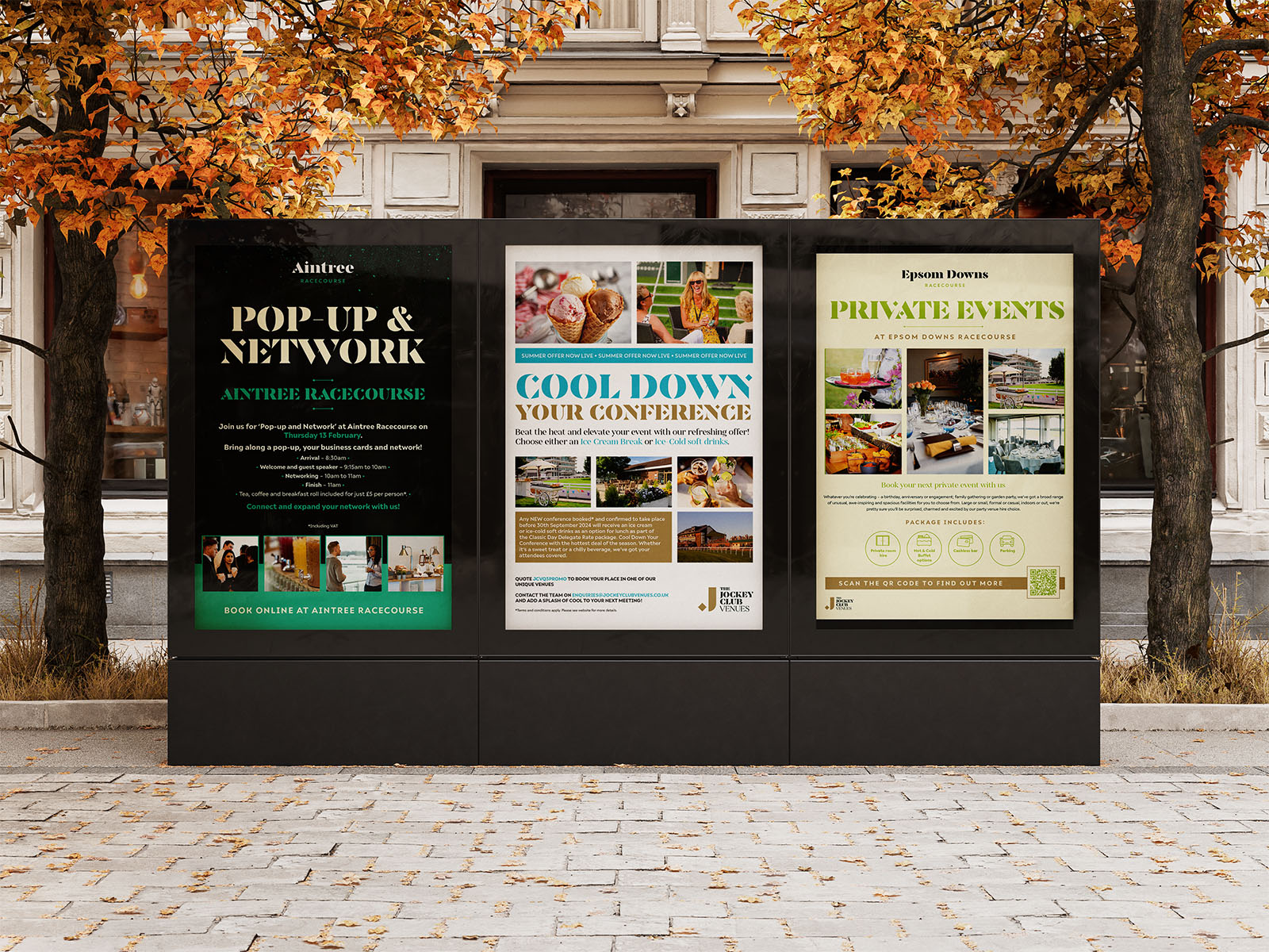
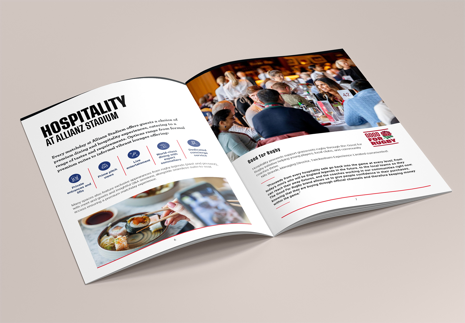
The RFU reports sit in a stack of sports and event print work we do — the England Rugby kit catalogue, the England Rugby Schools Cup Finals programme and posters, and an evolving suite of conference and events collateral for The Jockey Club, including printed brochures, venue maps and signage for racecourses like Cheltenham, Sandown Park and Epsom Downs.
Different formats, same discipline: print for sports and events, designed to be right on the day.
If you've got a document that has to be accurate, on brand and on time, take a look at the RFU Annual Report 2022 project or see more of our sports and print work. We're a design studio in West London, and we like the documents everyone else finds fiddly.