Picture the scene. You've just wrapped a positioning workshop. The walls are covered in sticky notes, and someone has written "bold but approachable" in marker. Everyone nods. Then the room empties, and nobody is quite sure what happens next. That gap between the whiteboard and the final logo is where most branding advice goes quiet. It tells you what belongs in the package, not how the pieces get chosen. This post is about the translation step: how a brand strategy becomes a visual identity a designer can actually defend. You'll start with what a positioning workshop really hands over, then look at why every design decision should cite the strategy behind it. From there, we'll walk through the handover between strategist and designer, then trace brand promises into logo construction, personality attributes into type choices, values and positioning into colour rules, and brand behaviours into layout and grid systems. A worked example shows one workshop output turning into real decisions, followed by what changed after review. Finally, you'll get a handover template and a simple way to test whether a rule holds up, so your brand strategy ends up as rules you can defend.
A two-day positioning workshop leaves you with more paper than you might expect. The genuinely useful pile includes a brand promise in one sentence, three to five personality attributes with definitions, a values list, an audience definition, a competitive frame, tone-of-voice words, and a "we are not" list. That last page is often the most valuable thing in the room.
Here's the bit most branding and brand strategy explainers skip: strategy outputs and design outputs are different animals. A workshop produces adjectives and intent. A designer needs constraints. The translation happens in the gap between the two, and someone has to do it deliberately.
So ask for a "so what" line next to every attribute. If "bold" appears in the deck, the document should say what bold changes: type weight, colour saturation, crop tightness, or all three. Adjectives with no consequences attached are just decoration in a nicer font.
Exclusion does more work than aspiration. A "we are not" list, say not clinical, not luxury, not playful, narrows the design space faster than any mood board. It shuts down the third round of "what if we tried..." before it starts, which is a gift to everyone's calendar.
And a workshop isn't a one-off event. The durable artefact from brand development and strategy work is a set of written rules that survives staff turnover, new hires and new agencies. People move on. The document shouldn't.
If you're booking a workshop, it helps to know what to expect from a design consultation before you sit down, so you know exactly which outputs you should be walking out with.
Picture a review meeting. One client says, "I like blue." Another says, "the palette has to signal calm authority, because the promise is steady hands under pressure." The second can be argued with. You can interrogate what calm authority means in saturation, temperature and contrast, and test whether the result lands. The first cannot be argued with at all. It ends the conversation, usually in favour of whoever is most senior in the room.
Run each design choice past three questions. Which workshop output does it cite? If we change it, what breaks in the brand? Who could challenge it, and on what grounds? A decision that survives all three is a rule. A decision that fails the first is decoration, and honesty beats pretending otherwise.
While one designer owns the brand, taste works as a standard. Once five people are producing decks, adverts and social posts, taste stops being a shared reference point. Written rules do the work instead. That's why brand guidelines matter: they replace memory with something a new hire, freelancer or agency can follow. It's also why consistency problems are usually handover problems, as a brand collateral update tends to show. In 2026, AI-driven marketing production makes explicit rules more valuable, not less. Faster asset generation produces more chances to drift.
Write each rule as a sentence someone could test. "The palette must signal calm authority" is testable: run it past buyers, check contrast ratios, compare it against competitors. "The palette should feel nice" is not. Neither is "the mark should feel premium." "The mark must stay legible at 10mm in one colour" is.
Next, the handover itself: who delivers what, and in which direction.
Here's the good news: the handover is not mysterious. It's a document swap, and both sides have a clear job to do.
The strategy pack is the brief everything else answers to. It should contain:
A positioning statement in one sentence
Three to five personality attributes, each with a definition and a "so what" line
Tone-of-voice words with written examples ("warm but not chummy" reads very differently in an email subject line than in a brochure headline)
Audience insight, proof points and the competitor frame
The must-avoid list
Not a mood board. The first return should be rationale-led: each design decision sits next to the workshop output it answers, in the same order the strategy document used. If the strategy opens with personality, so does the rationale. That makes the work reviewable rather than merely likeable. A systematic method sitting under the rationale step helps here; human-centred design frameworks such as ISO 9241-210 describe a structured process rather than leaning on taste alone.
Two or three rounds, each asking one clear question per direction. "Does this read as approachable expert?" gets a far better answer than "which one do you like?"
Sign-off happens against the strategy, not personal preference. Whoever signs off should be able to point at the line in the strategy document that justifies the decision.
When timelines are tight, a short design sprint compresses the handover into days without dropping the rationale step. Speed should come from the process, not from skipping the evidence.
With the handover agreed, the first thing to translate is the mark itself.
With the handover rhythm in place, the first design decision to nail down is the mark itself. Start with its job, not its shape. A brand strategy promising heritage, speed, craft or access changes what the logo must do long before anyone opens a type catalogue. Heritage needs a mark that feels established; speed needs one that reads instantly at small sizes; craft invites detail; access demands clarity.
Break the mark into decidable parts: wordmark, symbol or both; stroke contrast; geometric versus humanist letterforms; symmetry; and how much negative space it holds. Each choice should be a decision, not a default.
Worked mapping: "approachable expert" translates to humanist letterforms with open apertures, moderate stroke contrast, soft terminals and generous letter spacing. Geometric sans would read colder; tight spacing would feel more corporate. That reasoning is practitioner judgement, but it is still reasoning a designer can defend.
Set the constraint list alongside the design. Minimum sizes in millimetres for print and pixels for screen. Clear space measured in a unit of the mark, not a random gap. Our What we do covers how these rules sit inside a full identity system. Approved one-colour versions for stamps, invoices and embroidery. Surfaces the mark should never sit on: busy photography, low-contrast backgrounds, gradients that swallow the silhouette. For a look at how we translate strategy into a visual system, see the Solution we delivered for a brand with its own rules to defend.
Finally, cite the attribute behind every construction choice in the guidelines. "Moderate stroke contrast because the brand is approachable, not shouty." That way the mark can be revisited in five years without reopening the entire brand strategy.
With the mark's construction choices cited to the promise, the same evidence habit turns to type. Personality attributes aren't typefaces, but they do translate into characteristics you can name out loud: x-height (taller reads friendlier at body size), width, contrast between thick and thin strokes, terminal shape (soft and rounded versus sharp and cut), and whether the family feels formal or casual once it's set at 9 to 11pt. Ask your designer to write those traits down, because "warm" alone won't survive a handover.
Build a system, not a single typeface. Specify a role for display, headline, subhead and body, then add a fallback stack for email, documents and anywhere outside design's control. A Georgia or Arial fallback beats a beautiful font that vanishes the moment someone opens Outlook.
Make the rules measurable. Body copy sits around 45 to 75 characters per line for comfortable reading, with 80 characters as the accessibility ceiling for Latin text. Leading runs as a ratio of size, roughly 1.4 to 1.6 for body. All-caps gets added tracking. Hierarchy steps are fixed, not improvised.
A brand with "warm" and "direct" in its tone words often lands on a credible serif for headlines and a clean sans for body. The serif carries reassurance; the sans carries pace. Both choices should cite the tone words in the guidelines.
Watch practical constraints early. Licensing, web font weight counts and load performance sink more type systems than aesthetics do. Agree licensed weights, subsetting and web-safe fallbacks before design starts, not after the first page-speed report. Type settled, the next translation is colour, where values become jobs rather than swatches.
Type sets the voice; colour sets the temperature. Here's how brand strategy outputs become rules you can actually point at.
Calm, energy, premium and sustainability each pull saturation, temperature and contrast in different directions. Calm wants lower saturation and softer contrast; energy wants punch; premium often leans deeper and darker; sustainability tends to earthy, less synthetic. Write each down as a job, not a swatch. "Primary: calm authority, low saturation, mid-dark" beats a hex code with no explanation.
Primary, secondary, accent and neutral. Then functional states for digital work: error, success and warning. A palette without roles gets used at random.
WCAG asks for at least 4.5:1 for normal body text against its background and 3:1 for large text and interface elements. So list which pairs in your palette are approved for large type only. A 3.5:1 pair is fine for a headline and wrong for a paragraph. Also flag thin lines and anti-aliasing, which render fainter than the numbers suggest.
Print and screen are different animals. Note CMYK build limits so your deep navy doesn't turn to mud, keep Pantone references for spot work, and expect accent colours to shift on uncoated stock or a cheap laptop screen. Test both before you commit.
Run the palette past target buyers. Compare it against three competitors (if they all own blue, blue is a wasted signal). Check it in real context: a phone screen, a brochure spread. A white artboard flatters everything and proves nothing.
Colour gave the palette its job. Layout decides how the brand actually behaves. How dense or airy a page feels, how a spread opens, how often an element repeats: these are decisions, not defaults, and they belong in writing.
Structure first: column count and gutters, margin ratios (a margin roughly equal to one column is a solid starting point), a spacing scale such as 8, 16, 24, 40, 64, and rules for how images and type share a page. A 24pt step repeated across a brochure and a landing page makes them read as siblings rather than strangers.
"Calm" means more white space and fewer competing elements. "Energetic" means tighter crops, stronger contrast and shorter line lengths. Same tone-of-voice words from the workshop, translated into rhythm you can actually point at in a layout.
Hover states, transition timing and mobile breakpoints sit in the layout chapter, not a web appendix bolted on later. WCAG 2.1, still the version the W3C advises to maximise future applicability, covers desktops, laptops, kiosks and mobile devices, so one grid logic can carry across print and screen.
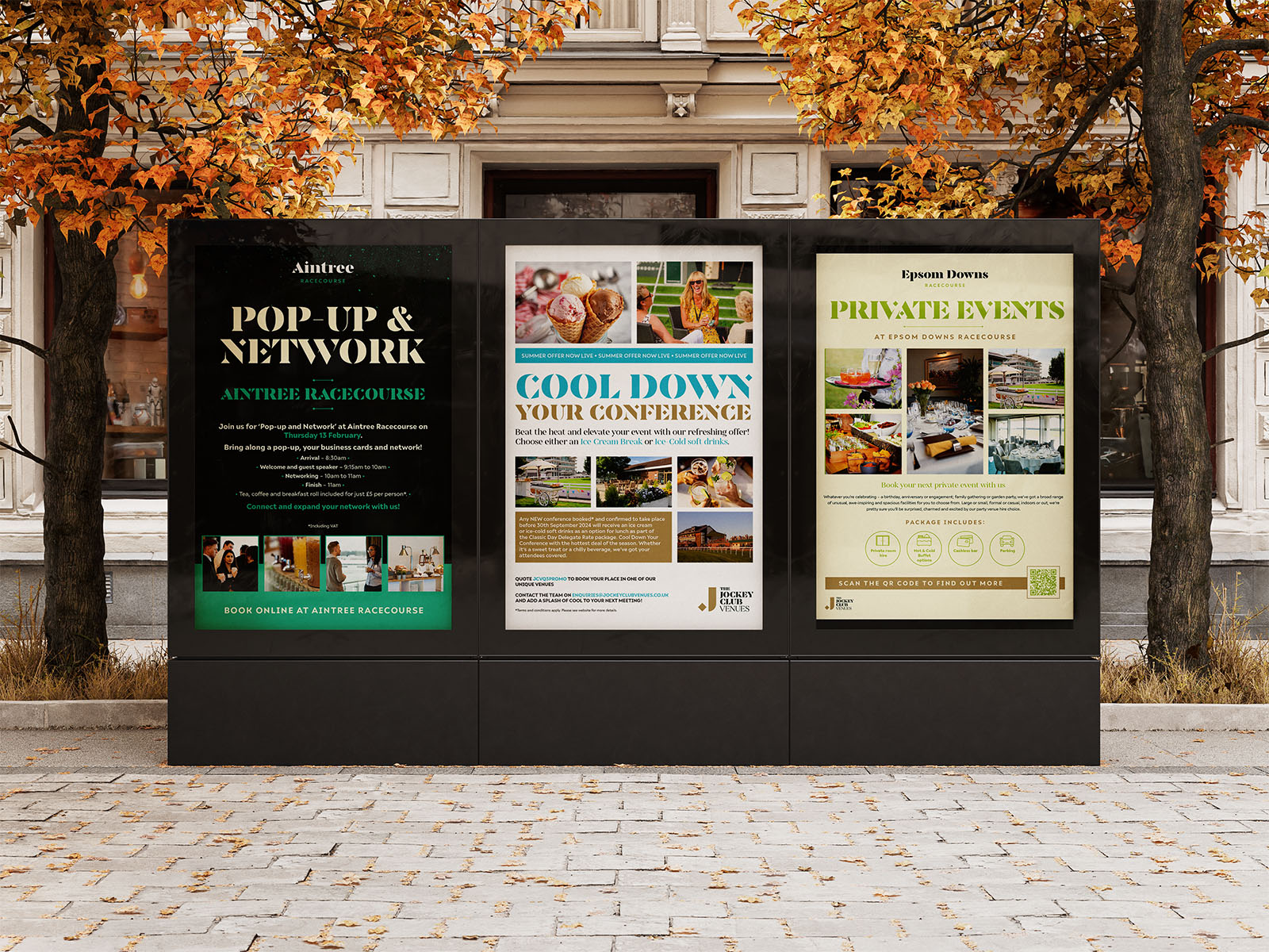
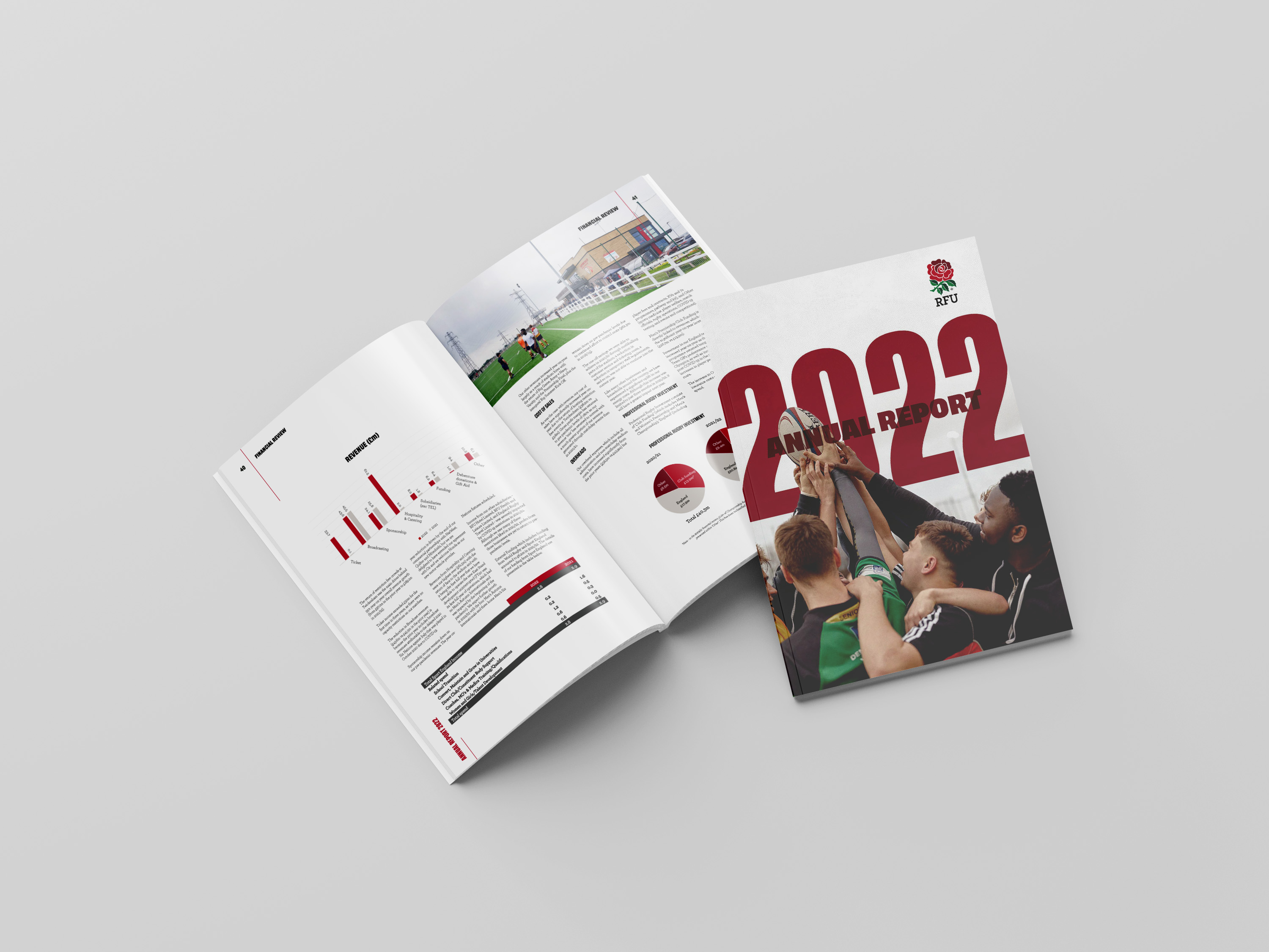
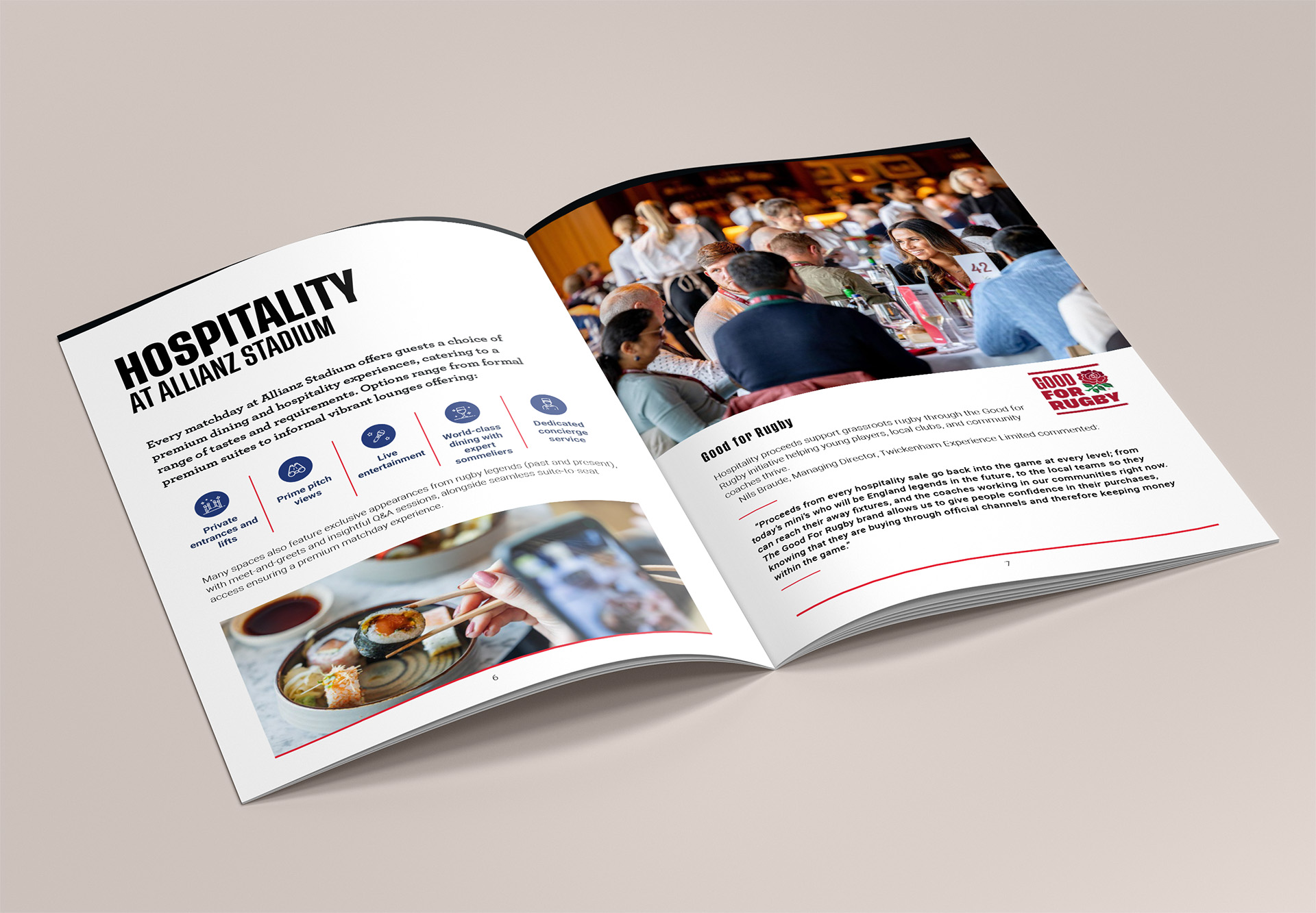
Layout rules are what keep a brochure, an advert and a website feeling like one brand. Without them, each supplier interprets the brand differently and the consistency you paid for quietly disappears. You can see what that discipline looks like in practice when the grid holds across every format. Next, we will walk through one workshop output at a time.
Picture a ten-person West London accountancy practice, repositioning from compliance filing to advisory work. The tables below follow the structure Graphics Monkey has used on projects of this shape. Every row names the workshop output, the decision it drives, the evidence and the test.
Workshop output | What it says |
|---|---|
Promise | "We make the numbers make sense" |
Attributes | Clear, calm, plain-speaking |
Tone words | Warm but not chummy |
Must-avoid | Corporate grey; startup playful |
Workshop output | Design decision | Evidence | Test |
|---|---|---|---|
Plain-speaking; not corporate grey | Humanist sans wordmark, moderate contrast, wide letter spacing, no symbol, plus a one-colour version for stamping documents | Letterforms read as speech, not institution; the spacing slows the eye | Five-second mark recognition test; proof at 12mm on a letterhead |
Plain-speaking; warm but not chummy | Serif for headlines, neutral sans for body, system fallbacks for client documents | The serif reassures; the sans carries the pace | Body-size legibility check; test in Word on a client's machine |
Clear; calm; not corporate grey | Deep green primary, warm sand neutral, one accent | Green moves away from the sector's default blue; sand keeps it soft | Contrast checked to WCAG 4.5:1 for body text; compared against three local competitors |
Clear; calm | Generous margins, single-column long-form, a repeating quote treatment for client stories | White space reads as unhurried; quotes prove the advisory voice | Uncoated print proof; read-through with two clients |
Read the left column first and the right column stops being a matter of taste. A rule that cannot cite a workshop output is decoration, and worth labelling as decoration. You can see the same discipline running through our featured projects, where each identity sits next to the thinking behind it.
Those rules went to review, and two came back changed. Here's the honest version, because the revisions matter as much as the originals.
The accent colour failed a contrast check at small sizes on screen. Body text needs 4.5:1 against its background, and it simply didn't clear the bar. So it got demoted: large type and graphic elements only, where the 3:1 threshold applies. The revision sits logged directly beneath the original rule, so anyone opening the guidelines later sees what changed and why.
The serif headline weight came down a notch after print proofs on uncoated stock. On screen it looked right. On paper it read heavier than intended. That's a production fact, not a matter of taste, so it earns a note too.
And that's the habit worth copying: no rule changes without a written reason. Six months after the launch presentation, when memories fade and new suppliers start asking questions, those little notes are what keep a brand strategy document believable. Which is why the template in the next section matters.
That review habit works even better when it lives inside the template itself. Five columns carry the weight: workshop output, design decision, evidence line, test method and owner. One row per decision. If a row cannot name the workshop output it answers, it does not belong in the document. That single rule stops most decisions being justified by vibes.
Keep it to one page per element: logo, type, colour, layout. Four pages, tops. A twelve-page template gets admired in the launch presentation and never opened again, which rather defeats the point of writing rules in the first place.
The evidence line is a sentence, not a word. "Wide letter spacing because the promise is plain-speaking" tells a freelancer what to do and why. "Spacing: generous" tells them nothing and gets ignored the moment a deadline tightens.
Every row needs a test method that actually fits the decision:
Contrast check for colour pairings and interface elements
Competitor comparison for palette and mark differentiation
Five-second recognition test for the logo
Audience interview where the question is genuinely open
Pick the method that lets the decision fail. A test nobody can fail is not a test.
Two last jobs for the template. It doubles as a briefing document for freelancers, partner agencies and new hires, so write it as if they are reading it cold. And keep it in the same folder as the logo files and type licences. The rules and the assets travel together, or neither gets used.
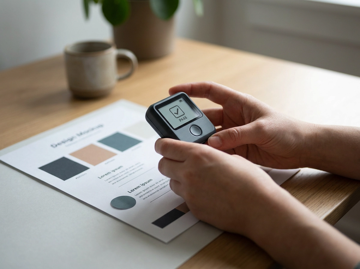
The template gives tests a home. It doesn't tell you what a good one looks like. Four cover most design rules: audience perception testing, competitor differentiation checks, in-context mockups and accessibility audits.
Start by framing the question so it can fail. "Does this palette read as trustworthy to our buyers?" is a test, because the answer could be no. "Do you like it?" is a preference poll with no wrong answer, so it teaches you nothing about whether the brand strategy actually landed. Swap liking for meaning and you get data you can act on.
Full research is rarely practical, so keep formats light. Five-second tests suit marks: show the logo, hide it, ask what people remember. Side-by-side comparisons work for palettes and type, shuffled so nobody spots the house favourite. Anything destined for paper goes through a printed proof. Screens flatter colour; uncoated stock rarely does.
When a rule needs to break, write the exception beside the rule and say why. WCAG does exactly this, exempting logotypes from text contrast requirements and stating the reason in the standard itself. An unexplained exception quietly dissolves the whole system, because the next person to touch the brand assumes the rules were never real.
Timing is where teams slip. A test run after sign-off is a eulogy, not a test. A short design sprint is a useful container: strategy, design and real users in one week, instead of a three-week email thread where feedback arrives far too late to change anything.
Those tests only work if there's a written rule waiting to be tested, and writing it down is the step most brand strategy documents quietly skip. A strategy that stays in the workshop deck can't be defended, audited or handed over to anyone.
Ask for the 'so what' line. Every personality attribute in your strategy should state what it changes in design. If "bold" sits in the deck without a note on type weight, colour saturation or crop tightness, it's a mood, not a rule. And a mood can't be argued with in a review.
Attach evidence to each decision. Every design choice should cite the workshop output it answers. If it can't cite one, it's decoration. That's fine, decoration has a job, but label it as decoration so nobody mistakes it for strategy.
Write the rules down before production starts. Not after the fifth person has "improved" the logo. A guidelines document assembled in hindsight is just a description of what happened, and it won't survive a new hire, a new agency or a new campaign.
Test what can be tested. Palette contrast, mark recognition and competitor differentiation all have cheap, fast methods. Contrast checks take minutes. Five-second tests take five seconds. Comparing your palette against three competitors takes an afternoon. None of it needs a research budget.
If the handover is where your project keeps stalling, a studio that runs this step as standard will help. Graphics Monkey builds brand strategy and visual identity work in West London, starting with positioning rather than a logo. Their brand identity design packages put the evidence trail at the centre of the process, so every colour, weight and margin has something to answer to.
A brand strategy becomes a visual identity when it stops sitting in a deck and starts making decisions. Ask the "so what" line. Attach evidence to every design choice. Write the rules before production begins. Test what can be tested. When you do this, colour, type, layout and logo stop being a matter of taste. They become calls you can explain, defend and repeat.
If your handover keeps stalling, Graphics Monkey runs this step as standard. Based in West London, they start with positioning rather than a logo. Their brand identity design packages put the evidence trail at the centre, so every colour, weight and margin has something to answer to. Bring the strategy. Then let the identity do its job.