You've spent hours perfecting that layout. The colours sing, the type is crisp, and on your monitor it looks like a brochure worth framing. Then the proof comes back from the printer and, well, it doesn't. The blue is muddy. The margins feel cramped. The fold lands right through a headline. Sound familiar?
Here's the thing about brochure design: the choices that matter most often happen before you open your layout software. Paper stock, binding, finishing, bleed, colour setup and proofing all shape what you can actually design. Pick them late and you spend your time fixing problems instead of creating.
This tutorial walks through the production decisions that come first. We'll cover why a design can shine on screen and still flop at press, how paper and binding set your page count and margins, and the folds, coatings, bleed and safe zone numbers to lock in early. Then we'll get into colour setup, soft versus hard proofs, and file prep with PDF/X, fonts and image resolution. You'll also find brochure design ideas that show the production, a pre-layout checklist, a studio workflow, and answers to common questions. Let's settle the press before we touch the pixels.
Screens glow; paper reflects. A monitor shows backlit RGB light. A brochure is CMYK ink on an absorbent surface, read by light bouncing off it. Same artwork, two systems that never agree.
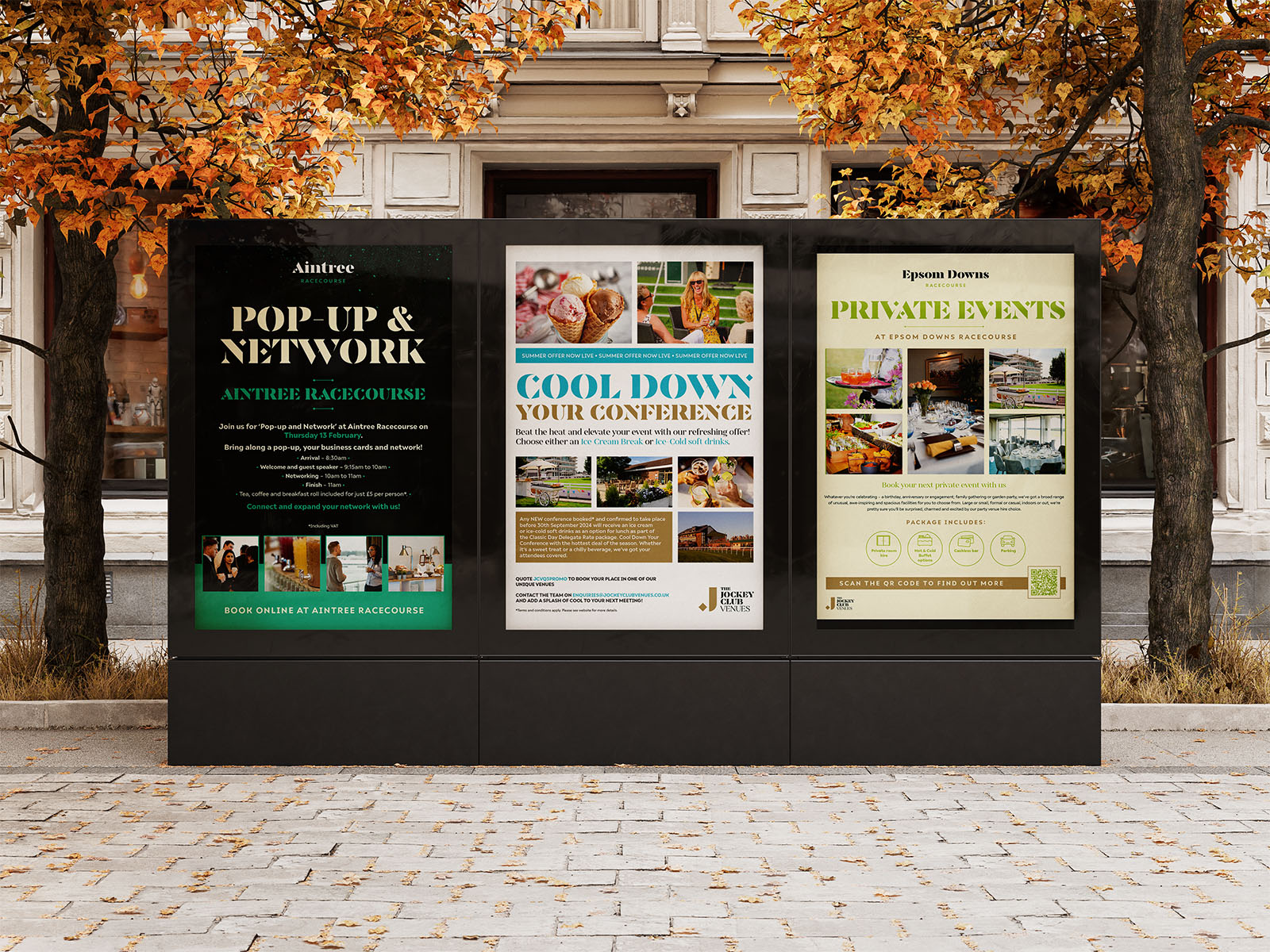
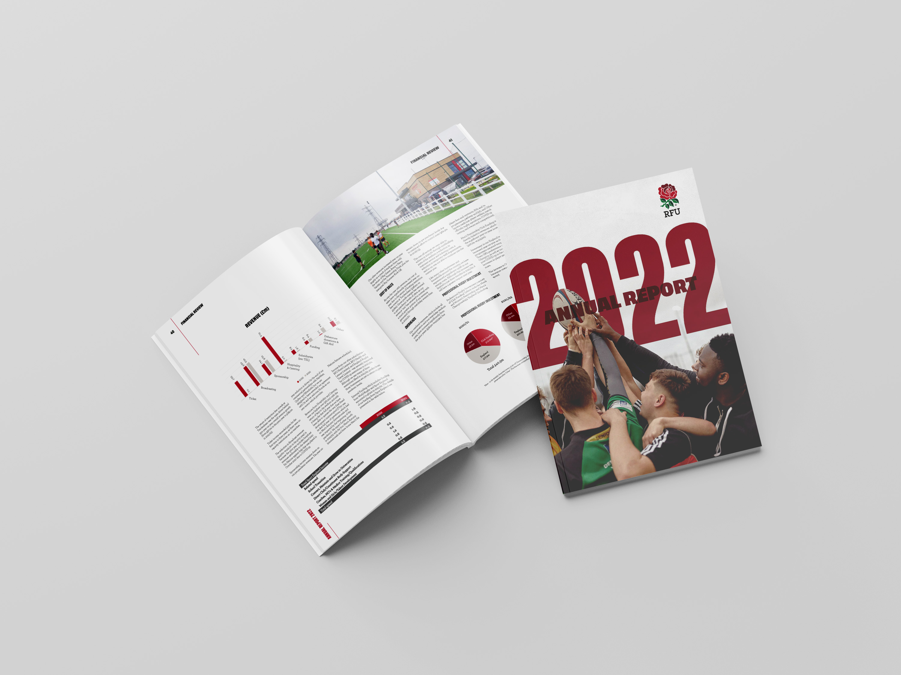
So failures stack up: vivid brand blue turns dull, thin type near the trim gets sliced, a hero photo loses its background because bleed was never set, and a spread disappears into the binding. See it in our CEGOS solution and Speakers' Corner brochure.
Cost matters. Changing a production decision on day one takes a phone call; changing it after layout, proofing and imposition takes a reprint. Settle the questions first: purpose, how it will be held and read, page count, quantity, budget and printer.
One honest caveat: colour standardisation across print processes is debated, and ISO 12647-2 currently sits as a committee draft on the ISO site, so confirm its status before citing it as settled.
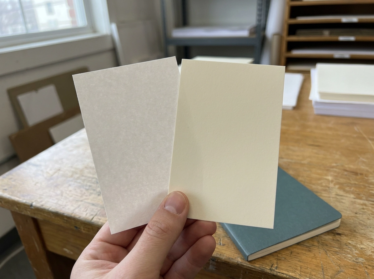
The first production decision is what you print on. Weight is measured in gsm (grams per square metre). A 130gsm text stock feels like a leaflet; a 250 to 300gsm cover stock feels worth keeping. Heavier stock costs more to post and handle.
Coating changes ink behaviour. Coated paper holds fine detail and sharp colour. Uncoated drinks ink in and softens gradients. Recycled stocks carry a warmth and texture that shifts every colour.
A coated 300gsm sheet can feel thinner than a bulky 250gsm uncoated one, so bulk matters as much as the number.
Stock reshapes layout. Dark or kraft-toned papers may need a spot white or foil to keep type legible. Hairlines that sing on coated stock can clog on uncoated.
Order a paper sample pack and proof on the actual stock. Confirm weights, bulk and availability with your printer, not from memory.
Stock sorted? Binding next, and it dictates page count and margins.
Saddle-stitched pages print as spreads folded in multiples of four: 12 pages works, 14 does not. Thicker stock worsens creep: outer pages push out further, so spreads near the centre shift inward to clear the trim.
Perfect binding needs a minimum page count to grip the spine. Spine width comes from paper bulk before cover artwork is drawn, and the inner margin needs widening so text does not vanish into the gutter.
Wiro and spiral open flat, letting crossovers run across the spread. Singer stitch and stitched options suit thin, premium booklets. Ask your printer for page-count rules and a spine width calculator.
A full-bleed photograph across a spread behaves differently in each method. Anything crossing the centre needs checking against binding and paper thickness.
Choose binding first; reversing it after layout is the costliest decision to make.
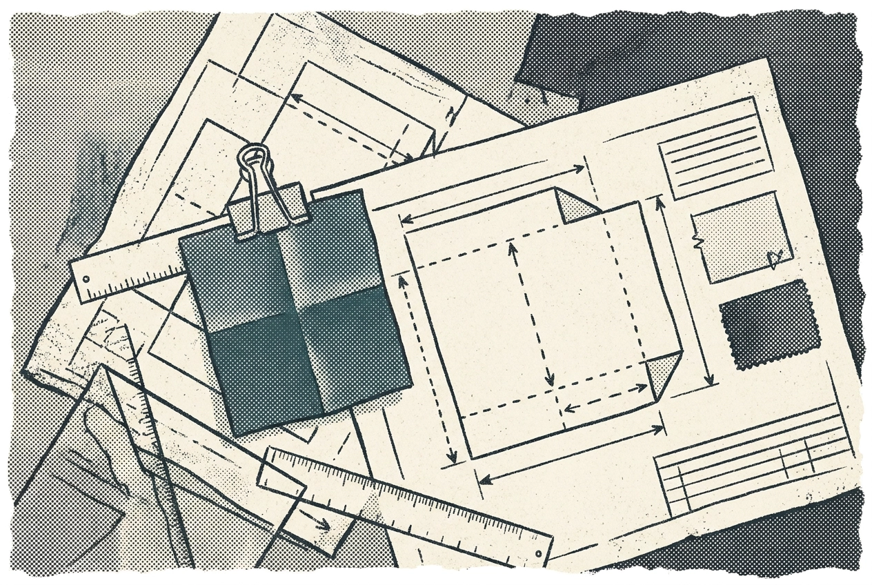
Binding done, folds are next: they decide reading order. A roll fold hides its reveal in the final panel, a gatefold splits into wide wings, a concertina reverses direction each time, a z-fold zigzags. Panel widths rarely match: compose the cover illustration for the fold sequence, not one flat rectangle. See our exhibition catalogue work.
Coatings set the mood: matt lamination reads understated and expensive, soft touch feels velvety, spot UV contrasts gloss with matt, uncoated takes no laminate.
Foil blocking, embossing and die cutting each add a production pass, their own artwork layer, set-up. Pick one or two hero elements, never sprinkled across a design.
In files, foil and emboss artwork needs its own layer or page, overprint matters where elements touch, and text or key imagery should sit a few millimetres clear of any fold or die line. Then request a folded, finished dummy to judge by hand.
Folds settled, now for the edge numbers. Bleed is the extra artwork running past the finished edge. Trim is where the guillotine actually cuts. The safe zone is the margin inside trim where text and logos stay put.
UK working figures: 3mm bleed on each edge, safe zone around 5mm. Confirm both with your printer and get them in writing, as digital, litho and wide-format houses sometimes differ, and large-format work can need considerably more.
Cutting drifts by a fraction of a millimetre. If a background or photo stops at trim, that drift leaves a white sliver on the finished edge, so extend it past.
Set the document to trimmed size and add bleed in the document settings rather than designing a bigger page. Export settings and printer specs then line up.
Next, colour reshapes your layout. A screen throws backlit RGB light; print is CMYK ink on paper, reflecting room light. CMYK cannot reach every vivid green, orange or blue in the RGB gamut, so those shades land duller. That is physics, not a printer fault.
Converting to CMYK with a coated profile gives different results from an uncoated profile, even from the same file, because a profile describes a printing condition tied to a specific stock. Convert early, before layout, not in the printer's automated settings.
A spot or Pantone ink holds a brand colour more consistently across stocks and runs, but adds a plate, set-up and cost. Most projects keep spot for one or two hero brand colours and run the rest in process CMYK.
Ink limits stop sheets smudging; a rich black build looks deeper than flat 100 percent black. Ask your printer for their limit. Solid panels, reversed-out type and subtle gradients need checking against stock and colour build. ISO 12647-2 is debated across offset and wide-format, so proof targets vary by press.
Your colour build only becomes real on paper. A soft proof is a calibrated on-screen preview; a hard proof is a physical sheet you can hold next to your brand colours. Soft proofs are quick and cheap, but they cannot show paper texture, laminate, foil or how ink sits on uncoated stock, so never sign off a colour-critical job on one.
Hard proofs earn their money on brand colour accuracy, skin tones, coated versus uncoated calls and long runs. Paying for a press proof beats paying for a reprint. Check colour against the brand guide, trim and fold positions, copy and contact details, page order and spread sequence, plus anything near a fold or trim. Build proofing into the timeline and budget from day one, and get written sign-off before the run. ISO 12647-7 covers digital proofing standards, but targets and tolerances differ by press type.
Once the proof is signed off, the last handover is the file. Printers want PDF/X, not your editable working file. It's a family of ISO standards built for prepress: it embeds fonts, locks the colour space and carries bleed and trim boxes, so your layout lands the same on every machine.
Fonts matter too. Embedding or outlining prevents substitutions. If anyone else handles the files, check your licence covers it.
Resolution is the quiet killer. 300 dpi at final printed size for photos; web images at 72 dpi go soft on paper. Stretch a 300 dpi image to double size and you're effectively printing at 150 dpi.
One stray RGB element in a CMYK document converts unpredictably, so preflight for odd colour spaces, low-res links and missing fonts. Ask your printer for their export preset and naming convention, and keep the native file alongside the PDF/X.
With the file press-ready, judge brochure design ideas by how they behave in the hand. Photograph finished pieces so the spine, fold line and trimmed edge show. Compare coated and uncoated covers in the same light.
Panel-led ideas only work with a chosen fold: a gatefold opening to one wide image, a concertina walking through steps, a roll fold hiding the call to action in its final panel.
Sometimes the stock is the design: a duplexed cover pairing contrasting papers, debossed type on chunky uncoated text stock, recycled board that reads considered rather than costly.
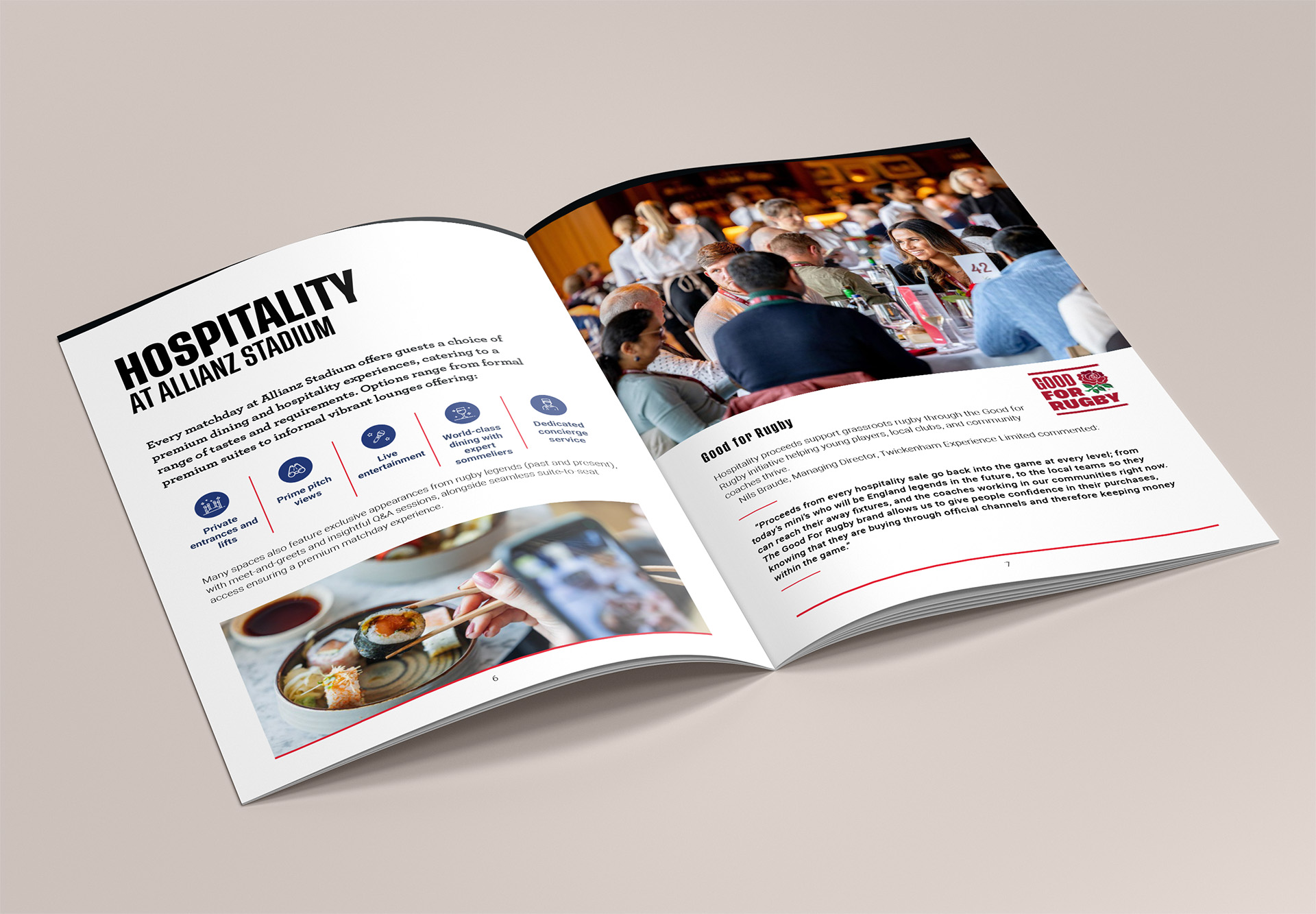
Budget decides. Three foil passes and a die cut is a different project from one spot colour and a clever fold. See our brochure and print design work and a Twickenham Christmas campaign solution for both ends.
Gather three to five references and annotate each, naming stock, binding or finishing. Not just the layout.
The references you have gathered are only useful once the production questions have answers. Before you open InDesign or Canva, get these settled in writing:
Brief: audience, key message, quantity, distribution method and rough budget per unit.
Format: trimmed size, page count, binding method, and whether any spread needs to run across the gutter.
Substrate and finishing: cover and text weights in gsm, coating or laminate, folds, foil, emboss or die cut.
Colour: CMYK or spot, brand colour references, ink limits, and whether a hard proof is required.
Technical: bleed and safe zone values confirmed with the printer, 300 dpi images at final size, embedded fonts, and a preflight-clean PDF/X.
Sign-off: who approves copy, colour and proof, by when, and who owns the final print-ready files.
Answering these on day one costs nothing. Changing them after proofing costs a reprint. For a look at what settled decisions produce, see how this kit catalogue handled stock, fold and colour from the brief stage.
Here's how a studio turns that checklist into practice. A designer's real job is translation: your printer's spec becomes document setup, so bleed, margins, page counts and colour builds are right from page one. A studio also brings paper sample packs for choosing stock by hand, direct liaison on spine width and trim, and press checks on longer runs. Graphics Monkey pairs brochure and editorial design with branding and campaign work, and design sprints settle production questions fast when deadlines bite. See our brochure design for Fulham Reach Boat Club and the background to our Street Photography International brochure. Bring a rough idea, a quantity and a budget: production questions get answered before layout starts, not after.
Quick answers to the questions we hear most:
How much bleed do I need? Usually 3mm on every edge in the UK. Confirm with your printer, as digital and wide-format work can differ.
Saddle stitch or perfect bind? Saddle stitch suits thinner, lighter booklets and opens flat. Perfect binding handles thicker documents and gives a printed spine, but needs a minimum page count and wider inner margins.
Why do my colours look different in print? Your screen glows with backlit RGB; paper reflects CMYK ink off a textured surface. Vivid colours shift. A hard proof on the actual stock is the only reliable way to judge.
What image resolution do I need? Aim for 300 dpi at final printed size, not the size it appears on screen.
Can I design a brochure in Canva or a template? You can, but check bleed, colour mode and export settings. Templates rarely get these right for a commercial printer.
Do I need a hard proof? Not always. It earns its keep when brand colour accuracy or a large print run is at stake.
Here's the short version worth pinning above your desk.
Production decisions are design decisions. Stock, binding, bleed and colour aren't admin that trails behind layout. They're the constraints that shape it.
Settle the sequence early: binding and page count first, then stock and finishing, then bleed and safe zones, then colour and proofing, then file setup.
Get the specifics in writing. Bleed values, spine widths, ink limits and press tolerances vary by process and supplier. Confirm them with your printer before you start.
Judge it in the hand. A folded dummy and a hard proof cost far less than a reprint.
Stuck on production questions? A studio used to working alongside printers can answer them at brief stage, keeping your project on schedule.